12. List your notes from Mr. Garland’s discussion in class on lighting and how to "go against" what your light meter.
Wednesday, May 18, 2011
2nd Semester - Asssignment #13
13. Search the internet and find 10 different portrait. Write a short statement as to why you were attracted to each photo.
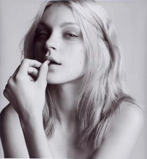
It's soft and pretty but shows character.

Classic and sweet looking.

Has an endearing vibe.

Interestly, slightly weird face but yet still beautiful.

Intense and striking.

It's very intruiging and mysterious.

Different, a bit androgynous.

Strong, intense, and dramatic.
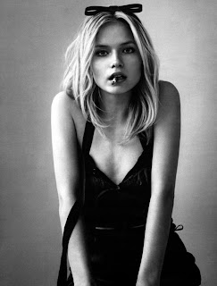
Shows a sense of character.

Very different and unusual.

It's soft and pretty but shows character.

Classic and sweet looking.

Has an endearing vibe.
Interestly, slightly weird face but yet still beautiful.
Intense and striking.

It's very intruiging and mysterious.
Different, a bit androgynous.
Strong, intense, and dramatic.

Shows a sense of character.
Very different and unusual.
2nd Semester - 11
11. What makes a great portrait? There is no one right answer to this, but you will certainly have a few ideas of an approach that is right for you.
There are alot of great things that make a great portrait. It's not just about a person standing in front of a wall and just snaping a shot. It's about capturing a person's essence and personality while still being natural and not forcing something for the camera. It's about capturing both the highlights of their physical appearences and what makes them interesting on the outside, but also what exudes from within.
2nd Semester - Assignment #10
10. This entry is taken from the National Geographic DVD – The Photographers
List 5 ideas (compositional approaches, lighting techniques, etc.) that you noticed in the DVD that would make you a better photographer.
1 Photographing at different angles.
2 Thinking outside the box.
3 Have your back facing the light.
4 Have a focal point in each photograph.
5 Using rule of thirds.
Describe your favorite photographer in the DVD. Let me know why you liked their approach or style.
I don't remember his name but there was this guy taking pictures in very harsh conditions, with bugs biting and crawling all over him and getting in his eyes, but he still worked through those conditions and got amazing photographs. I thought it was cool that he didn't stop him from doing his thing.
What was your favorite photograph? Why?
My favorite photograph was of the woman with the red hood and light green eyes. I think it was very intense and and very striking. It was the main photograph that stuck in my head after I finished watching the DVD.
Did any of these photographs help reinforce some of the ideas that we have discussed in photography class? List and describe at least two that you noticed.
Yes, like the photograph of the Afghan girl, with a strong focus on her eyes. Also using rule of thirds alot to make a photograph more interesting.
2nd Semester - Assignment #7
7. Search the internet and find 5 photos that utilize "framing" in different ways. Write a short statement as to why you were attracted to each photo.

It's a really beautiful nature photograph.

It's like showing a window into another world.

I think the framing was used in a really cool way here.

Very beautiful scenery, great use of framing that makes the color of the ocean pop.

Cool candid moment that uses framing.
It's a really beautiful nature photograph.
It's like showing a window into another world.
I think the framing was used in a really cool way here.
Very beautiful scenery, great use of framing that makes the color of the ocean pop.
Cool candid moment that uses framing.
2nd Semester - Assignment #5
5. Search the internet and find 5 photos that utilize "hands and feet" in different ways. Write a short statement as to why you were attracted to each photo.
 \
\
Really sweet picture of what looks like a grandpa holding his grandchild's hand.

Another really nice picture of a dad holding his small baby in his hands.

Very unique picture of a hand painted to look like a zebra.

Cute picture of a mother holding a new born baby's feet.

Interesting point of view with all the family's feet lined up.
Really sweet picture of what looks like a grandpa holding his grandchild's hand.
Another really nice picture of a dad holding his small baby in his hands.
Very unique picture of a hand painted to look like a zebra.

Cute picture of a mother holding a new born baby's feet.
Interesting point of view with all the family's feet lined up.
2nd Semester - Assignment #3
3. Search the internet and find 5 photos that utilize "rule of thirds" in different ways. Write a short statement as to why you were attracted to each photo

Really cool scenery with great color and use of rule of thirds.
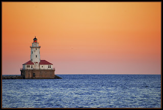
It's simple but really beautiful and would look great hanging on a wall in a room!

Just an absolutely incredible photograph. It manages to be dirty and grimy yet beautiful and serene at the same time.

I love cities at night with all the lights reflecting on the water.

Love the use of shadows with the figure.
Really cool scenery with great color and use of rule of thirds.

It's simple but really beautiful and would look great hanging on a wall in a room!
Just an absolutely incredible photograph. It manages to be dirty and grimy yet beautiful and serene at the same time.
I love cities at night with all the lights reflecting on the water.
Love the use of shadows with the figure.
2nd Semester - Assignment #2, #4, #6, #8, #9, #14 [Critiques]
2. Go into your blog and copy one photo from YOUR "conveying a message" assignment. Give an honest critique of that photo. Are you happy with it? If so, what do you like? If not, what would you change? Is there anything you could improve upon?

I am very happy with how this photo turned out. I love the dramatic lighting and shadows, I think it creates a very interesting atmosphere. It captured a great moment of human/animal affection. The only thing I don't like is some of the scratch/dust marks but there's nothing I could do to get rid of them.
4. Go into your blog and copy one photo from YOUR "rule of thirds" assignment. Give an honest critique of that photo. Are you happy with it? If so, what do you like? If not, what would you change? Is there anything you could improve upon?

I absolutely love this photograph, I think it is really cool. It was taken at a train station in Washington DC. It was very dark in the building but I was able to get a great shot with some great contast. I don't really have any critisms for it.
14. Go into your blog and copy one photo from YOUR "portraits" assignment. Give an honest critique of that photo. Are you happy with it? If so, what do you like? If not, what would you change? Is there anything you could improve upon?

I really like this photo. I am happy with how it turned out and I like the positioning of the subject. I can't really think of what I could do to improve it except making burn the left side because it's a bit too light.
6. Go into your blog and copy one photo from YOUR "hands and feet" assignment. Give an honest critique of that photo. Are you happy with it? If so, what do you like? If not, what would you change? Is there anything you could improve upon?

I also really love this picture. I think it's very intense and emotional and it's as if there's a story behind it. The focal point is the eye that really makes the picture great because it's intense and filled with emotion. I think the color contrast is great as well, with areas of light and dark.
8. Go into your blog and copy one photo from YOUR "framing" assignment. Give an honest critique of that photo. Are you happy with it? If so, what do you like? If not, what would you change? Is there anything you could improve upon?

Ignore the stain, this is my "mistake" copy (I can't find the real one). I like this picture, but I think it's a bit dark and blurry, I wish it was more clear. But I like the concept and idea of it.
9. Go into your blog and copy one photo from YOUR "making a positive from a negative" assignment. Give an honest critique of that photo. Are you happy with it? If so, what do you like? If not, what would you change? Is there anything you could improve upon?
I'm really happy with how this photograph came out, I think it looks pretty cool. I wish it was a little less dark but I am still happy with it despite that.
2nd Semester - Assignment #1
This photograph is making a statement about the BP oil spill. It has a very dark atmopshere and definitely provokes alot of emotion which is what attracted me to it.
This photo is from an editorial doing a dramatic portrayal of life in rehab, it was done in 2007 and inspired by the time when many girls in Hollywood were 'misbehaving' and sent to rehab. I think it definitely portrays a strong message.
Monday, March 28, 2011
Sunday, March 27, 2011
Assignment #8
LONG DEPTH OF FIELD

I love this photograph. It uses a very small aperture to create a great depth of field.

This also portrays a great depth of field by being taken at a far away distance and using a small aperture.

Same as above.
SHALLOW DEPTH OF FIELD

Large aperture to create shallow depth and central focus.

Large aperture again with a focus on the face.

Focus on the main object (model) with blurred background using large aperture.
I love this photograph. It uses a very small aperture to create a great depth of field.
This also portrays a great depth of field by being taken at a far away distance and using a small aperture.
Same as above.
SHALLOW DEPTH OF FIELD
Large aperture to create shallow depth and central focus.
Large aperture again with a focus on the face.

Focus on the main object (model) with blurred background using large aperture.
Assignment #5
This photograph is a great inspiration, especially for a portrait. It uses rule of thirds, has an intense focal point (the eyes), and has a great use and shadows and dodging/burning. It is definitely something I feel like I could also acheive in a photograph.
Monday, March 7, 2011
Assignment #3
3. Scan one of the photos I have at my desk. In your journal write the first words that come to mind when viewing the image. Explain in a paragraph how that word is visually connected to the image. Describe the composition talking about the basic shapes that make up the image and how they are placed to make up the composition.
Words that come to mind: Crowded, Exciting, Festive, Commotion, Busy
In the picture you see many many people and faces, most showing happy and excited emotions. Everyone appears to be gathered around and observing something. Even people on the balcony's of buildings are looking on. The two buildings give the picture a very long depth of field, as if the image goes on forever and ever. The photograph portrays a sense of mystery as well, as you don't know what it is all the people are looking at.
Assignment #4
4. Draw a map of your house or neighborhood. As you draw, label as many things as you can. Use the map to help you remember where things are located and what memory is associated with an area or space. If you are drawing your house, then add furniture; if your neighborhood, add some of the things in nature (ex. Tree, plants, etc.) When you finish the map, make a list of interesting things/places that you might photograph. Scan this and add it to your journal.
-Trees and logs in the forest.
-Design and portions of house.
-Plants and flowers in yard.
-Wild animals like squirrels in forest.
Thursday, February 17, 2011
Assignments #7, #9, #11 - Critiques
Stop Action/Motion Blur
I am pleased with how my pictures turned out, but there is definitely much room for improvement. I really like the picture with Erin's hair whipped to the side. However, I wish I had the camera panned down more so her head is closer to the top of the picture. I love the kicking pose in the other picture, I think it's perfect. But what I don't like is the image turned out too grainy, dark, and blurry. There are dust marks and scratches on both pictures which I don't like either, so I'll have to find a way to avoid that in the future. I would give myself maybe a 6.8/10 or a 7/10.
Depth of Field
I am not that happy with how my pictures turned out. I like the idea I had behind the Giraffe picture but the image turned out too blurry and there are objects in the corner that distract from the main idea of the picture. But this was the only high depth of field photo I took that actually turned out alright. I do like the picture of my cat but I think it turned out too dark and was also not sharp enough. I would give myself a 5.5/10.
Lines
I am quite satisfied with how these pictures turn out. I really like the picture of the trees behind the window because of all the lines in it and I think it's a simple but bold photograph. I also really like my other picture. I thought the light was reminiscent of waves in the way that the lines curled, so I took a handmade figurine that we bought from Vietnam that showed two men on a small boat, and put it on the light hanger. The only thing I don't like about it is I wish the figurine was more in focus. I would give myself a 7.5/10.
Subscribe to:
Comments (Atom)


